More Data Visualization with Python (now with Bokeh)
March 15, 2016
Introduction
After having talked about the entry door for Data Visualization in Python (matplotlib) on this post, let’s talk now about Bokeh.
Bokeh (official website) is a Python library for interactive data visualization, with a style similar to D3.js. Its objective is to allow the creation of interactive charts, dashboards and Data applications.
Installation
Bokeh does not come installed with Anaconda, but it is very simple to install it. If you are using Anaconda, you only need one command to install it:
conda install bokehIf you have all dependencies installed (NumPy, Pandas, Redis, among others) you can also install Bokeh through pip.
If you want more information about Bokeh’s installation, you can check them clicking here.
Getting Started
Well, let’s start using Bokeh. First with a very simple example, like always ;)
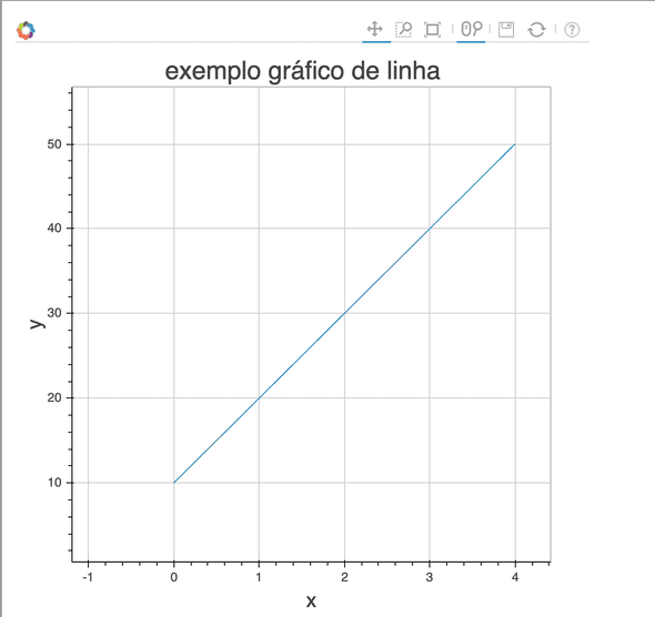
Let’s do our basic line chart. First, we will prepare the data for the chart, define the output file with the output_file function and create a figure for chart plotting with the figure function, setting up its title and the axes titles. Then we will plot the line passing to the line method the chart data that we prepared, and finally we will use the show method to show the figure:
import pandas as pd
import numpy as np
from bokeh.plotting import figure, output_file, show

# Data preparation
y = [10, 20, 30, 40, 50]
x = range(len(y))

# Configuring plot output file
output_file("bokeh_example_1.html", title="Bokeh Line Chart Example")

# Create the figure and define some properties
fig = figure(title="Bokeh Line Chart Example", x_axis_label='x', y_axis_label='y')

# Add the line
fig.line(x, y)

# Show results, similar to matplotlib
show(fig)Note that you can pan the chart, save, zoom in with the mouse scroll. This interactivity is really nice when you want to create a web application that involves charts.
Scatter Plots
Now, let’s see how we can create a scatter plot with Bokeh, like the one we created on the previous post. Like the first example, we will set the data that will be used for the plot, extracting them from the Titanic Dataset. Then, we will configure the output file and the figure, but now we will use the circle function from the figure to create the plot points. Let’s set an alpha value for transparency and the size of the points:
train_df = pd.read_csv('train.csv')

ages = train_df['Age']
fare = train_df['Fare']

output_file("bokeh_scatter_example.html", title="Bokeh Scatter Plot Example")

fig2 = figure(title="Bokeh Scatter Plot Example", x_axis_label='Age',
              y_axis_label='Fare')

fig2.circle(ages, fare, size=5, alpha=0.5)

show(fig2)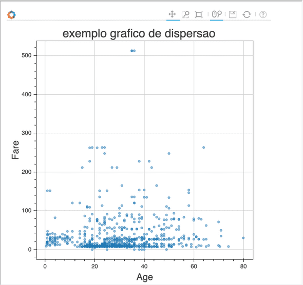
Nice, isn’t it? Now let’s create some bar charts. Bar charts in Bokeh works a little differently.
Bar Charts
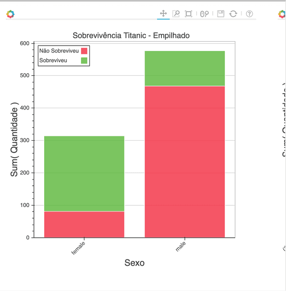
Data for a Bar Chart in Bokeh is organized in Python Dictionaries, composed of Lists with the values to be used on the chart. Let’s see the Titanic survival by gender example with Bokeh. Additionally, we will create multiple charts, and then we can learn how to create both simple bar charts and stacked bar charts.
First, let’s define the values we need. We will need the quantity of survivors and non survivors for each gender. Let’s use Pandas’ pivot_table to calculate that. Then, we need to transform the values in a Python List. The List will contain the count of “female”, non survivors and survivors, in this order, and then “male”, in the same order. The “gender” and “survival” lists need to indicate to which category these values belong. So, if the first value on the quantities list refers to female non survivors, the first item in the gender list needs to be “female” and the first item in the survival List needs to be “not survived”, and so on for the remaining values of the lists.
Then we will use the Bar class that we imported to create two charts (one stacked and one not stacked). For this function, we will pass the created Dict (that we called chart_data), indicate which values should be aggregated (the quantity key on the Dict), which key is going to be the label and the title. For the non stacked chart, we will pass two variables to the label parameter, and Bokeh will create four bars, for each combination that is possible with the keys on the label. For the stacked chart, we will set through which variable the chart should be stacked, in this case, the survival key. This should be passed to the stack parameter, and the other key should be passed to the label parameter. To show the charts, we will use the hplot function, which creates multiple plots on the horizontal. This is what the result looks like:
from bokeh.charts import Bar, hplot

table = pd.pivot_table(data=train_df, values='PassengerId', index='Sex',
                        columns='Survived', aggfunc='count')

chart_values = list(table.ix['female'].values)
for item in (list(table.ix['male'].values)):
    chart_values.append(item)

output_file("bokeh_barchart_example.html", title="Bokeh Bar Chart Example")

chart_data = {
    'survival': ['Not Survived', 'Survived', 'Not Survived', 'Survived'],
    'gender': ['female', 'female', 'male', 'male'],
    'quantity': chart_values
}

bar = Bar(chart_data, values='quantity', label='gender', stack='survival',
          title="Titanic Survival by Gender - Stacked", legend='top_left')

bar2 = Bar(chart_data, values='quantity', label=['gender', 'survival'],
           title="Titanic Survival by Gender")

show(hplot(bar, bar2))Histograms
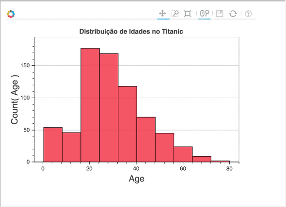
Histograms on Bokeh are pretty simple. We need to import the Histogram class. To this class, we can pass the Dataframe itself, and then the variable that will be plotted on the Histogram. We can also define the number of bins, through the bins parameter. Let’s plot a Histogram of the Ages of the Titanic Dataset, with 10 bins.
from bokeh.charts import Histogram

hist = Histogram(train_df, values="Age",
                 title="Age Distribution on Titanic", bins=10)

output_file("bokeh_histogram_example.html", title="Bokeh Histogram Example")

show(hist)Boxplots
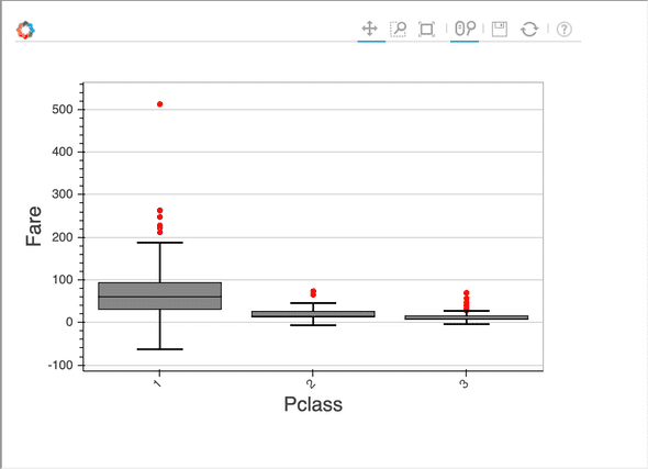
Boxplots are interesting when you want to visualize variation on values in a category and possible outliers. Let’s create one to see how Fare varies according to the Passenger Class on the Titanic.
Let’s import the Boxplot class and pass the Dataframe to it. Then, we need to define the variable with the values to be aggregated on the Boxplot and to the label parameter we shall pass the variable that contains the category. In this case, we will pass the “Fare” column to the values and the “Pclass” column to the label, and then, each unique value in the “Pclass” column will be a different box.
from bokeh.charts import BoxPlot

box = BoxPlot(train_df, label="Pclass", values="Fare")

output_file("bokeh_boxplot_example.html", title="Bokeh Boxplot Example")

show(box)We’re getting to the end and maybe you are asking where the pie charts are. As far as I know, pie charts do not have a very good support on Bokeh. They are not even mentioned on the official documentation. That being said, maybe they add it in a future release. For now, we have to live without it in Bokeh.
In the next post, Seaborn, to improve matplotlib charts. Stay tuned :)
Regards!
