Data Visualization with Python (matplotlib)
March 08, 2016
Introduction
Data visualization is an essential aspect of Data Analysis. Intelligent visualizations allow new discoveries, insights and knowledges through selected plots and tables.
There are a lot of tools for Data Visualization, and every day new ones appears. We will focus on the one that is probably the most used for this end in Python, matplotlib.
matplotlib
matplotlib (http://matplotlib.org/) is a Python library for creation of 2D plots, widely used for data visualization and able to create lots of different plot types, like bar charts, pie charts, histograms, among others.
matplotlib is already included in the Anaconda distribution (and in practically every distribution focused in Data Analysis and scientific programming). So, if you are already using it, there is no need for any installation. But, if you need to install it, here’s the link with matplotlib installation instructions.
Making your first plots
Well, let’s start with a really simple example. In first place, it is a convention to import the collection of matplotlib commands known as pyplot. This collection, according to the official documentation, makes matplotlib work in a similar way to MATLAB. We normally import it as plt. With that out of the way, on matplotlib, each command executes one alteration on the plot, like the creation of the area where everything is plotted, plotting of the points, change in labels, and the final command to show the plot. Let’s pass a list to the plot() command and then use the show() command to, well, show the plot:
import pandas as pd
import numpy as np
import matplotlib.pyplot as plt
plt.plot([0,10,20,30])
plt.show()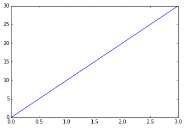
By default, when the plot command receives a list, it will create a line chart, with the list indexes on the X axis and the list itens on the Y axis, as we could see above.
For the second example, we will define the X axis points. Additionally, we will pass a third parameter to the plot function, defining the formatting of the points and line of the chart. We will create the chart with red square markers and a dashed line, passing as parameters color, linestyle and marker. We will use "r" for the color red, "--" for the dashed linestyle and "s" for the square markers. Lastly, we will make the line a little thicker with linewidth. Let’s also define both axes minimum and maximum values with the axis() function from pyplot. In this function, we will pass values for the X axis and then for the Y axis, defining the minimum and maximum values for each one:
plt.plot([10,20,30,40], [15, 40, 75, 90], linestyle='--', color='r', marker='s',
         linewidth=3.0)
plt.axis([0,50,0,100])
plt.show()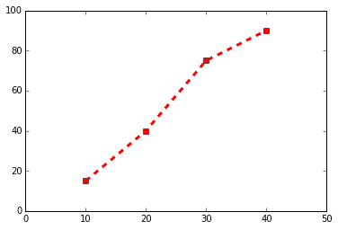
Bar chart
Another very popular chart on matplotlib is the bar chart. For the bar chart we will use the bar() function, where we define the position of the bars on the X axis and their height on the Y axis. Additionally, we can also configure another characteristics for the chart, like width of the bars, color, among others. The X axis will be a range with the same quantity of items as the Y axis. Let’s see a simple example, where we will store the configurations we want in variables and then we will pass them to the bar() function:
# Variables for the bar chart
y_axis = [20,50,30]
x_axis = range(len(y_axis))
width_n = 0.4
bar_color = 'yellow'

plt.bar(x_axis, y_axis, width=width_n, color=bar_color)
plt.show()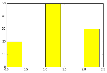
With the align="center" parameter, the bars will be centralized around the positions defined for the X axis, as you can see in the example below:
plt.bar(x_axis, y_axis, width=width_n, color=bar_color, align='center')
plt.show()
Now, let’s use the Titanic dataset (check here) to create a stacked bar chart, where we will be able to see survival for each gender. First we will use the pivot_table() function from Pandas to create a table that will aggregate the mentioned values, where we will pass the variables that should be on the rows and columns, the function to aggregate the values (it can be sum, count, among others) and the values to which this function will be applied dividing among the values already defined for the X and Y axes. To anyone who have used the pivot table from Microsoft Excel, this is easier to understand. After that, we will use the data to create the stacked bar chart:
table = pd.pivot_table(data=train_df, values='PassengerId', index='Sex', columns='Survived', aggfunc='count')
print(table)
Survived    0    1
Sex
female     81  233
male      468  109

# Array with the non survivors, divided between male and female
bar_1 = table[0]
# Array with the survivors, divided between male and female
bar_2 = table[1]
# Range com a quantidade de itens das barras
x_pos = np.arange(len(bar_1))

first_bar = plt.bar(x_pos, bar_1, 0.5, color='b')
second_bar = plt.bar(x_pos, bar_2, 0.5, color='y', bottom=bar_1)
# Definir position and labels for the X axis
plt.xticks(x_pos+0.25, ('Female','Male'))

plt.show()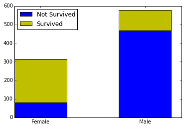
Bars are created with the bar() function, where we define the start of the bars positions on the X axis, their height on the Y axis, the width of the bar and its color. The xticks() function will define labels on the X axis. First we will define its position and then provide a Tuple with the values to be included in the chart.
However, what would be even better to make this comparison is two pie charts, showing in percentage terms how many survived and how many didn’t for each gender. Let’s use this opportunity to learn both how to create pie charts and how to create multiple charts on one “image”.
Pie charts and multiplots
For multiple plots, we use the subplots() function. This function creates what matplotlib calls a figure. Figures are the spaces where the plots are created. Figures work like Python lists for plotting. In cases where there is only one row or column, it will function like a one dimension list. For cases where there are both more than 1 row and more than 1 column, it will function like a two dimensions list. Here, we will create a figure with two columns and one row, where we will put our pie charts side by side using the pie function. In this function, we will define the values that will be in each chart and labels for these values. We will also include percentages for each values, along with its formatting and colors for each slice of the pie. After that, we will include a title for each plot and we’ll also use the axis('equal') option so that the charts will be round and not elliptical (this is purely aesthetic).
# Create the lists with survival values for each gender
pie_female = table.loc['female']
pie_male = table.loc['male']

# Create the figure with one row and two columns. Figsize will define the figure size
fig, axes = plt.subplots(nrows=1, ncols=2, figsize=(8,4))
# Create the pie chart on the first position with the given configurations
pie_1 = axes[0].pie(pie_female, labels=['Not survived','Survived'],
                    autopct='%1.1f%%', colors=['gold', 'lightskyblue'])
# Define this plot title
axes[0].set_title('Female')
# Make both axes equal, so that the chart is round
axes[0].axis('equal')
# Same as above, for the second pie chart
pie_2 = axes[1].pie(pie_male, labels=['Not survived','Survived'],
                    autopct='%1.1f%%', startangle=90, colors=['gold', 'lightskyblue'])
axes[1].set_title('Male')
plt.axis('equal')
# Adjust the space between the two charts
plt.subplots_adjust(wspace=1)
plt.show()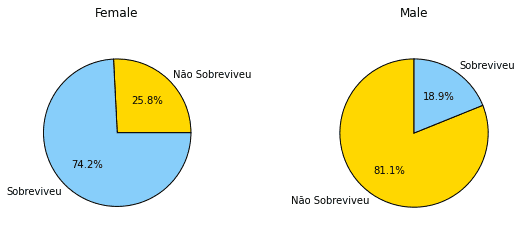
Scatter Plot
Another useful chart that you can make on matplotlib is the scatter plot. We use the scatter plot when we want to see if two variables are related. The pyplot function is scatter(). Let’s see, for example, if there is a relation in the Titanic dataset between the age of the passengers and the fare they paid. We will pass these values to the scatter function, the first variable for the X axis and the second to the Y axis. We will also define a value for alpha, so the points will be transparent and we can see better some points which are on top of each other. We will also define the c parameter, so the colors change along with the fare value.
scatter_plot = plt.scatter(train_df['Age'], train_df['Fare'], alpha=0.5,
                           c=train_df['Fare'])
plt.show()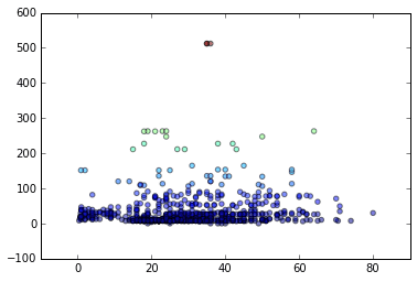
It is also possible to configure the s parameter, so the size of the points varies. You just have to pass the variable which will ‘guide’ the size, like we did with the c parameter.
Histograms
Histograms are useful to visualize the distribution of a series of values. Let’s see how the ages of the Titanic passenger is distributed with a histogram. The function in this case is hist(). In this function, we will pass as parameters the ages values and the quantity of bars, or bins. The number of bins is optional, but if you don’t pass any, it will be set by default to 10. First, we will make the filling of missing values for the age values, like we explained in this post, because the hist() function will return an error if there is any missing value in the data.
train_df['Age'].fillna(train_df['Age'].mean(), inplace=True)
histogram_example = plt.hist(train_df['Age'], bins=15)
plt.show()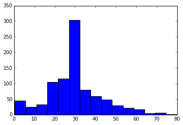
There is a lot of other charts in matplotlib, like boxplots, radar charts, among others. But I believe that the charts shown above are the most useful and the most used for data analysis. In the next post, we will possibly talk more about Data Visualization, exploring Seaborn.
Stay tuned! :)